
Visoir
Thought: Niche creators on social media would benefit from an app that simplifies personal branding. Being a branding junkie, I wanted to make content editing seamless for creators and introduce visual consistency as an intuitive concept. I gave Visoir an edgy brand and handled the design of many modern social media branding sets and templates for different niches.
And, hey, it got the Hot this Week badge from Apple.
-
Co-founder & Creative everything
-
Market research — Creative concept — Brand naming — Product positioning — Branding strategy — Visual direction — Target audience & psychographics — Content design — App Store presence & graphic design — Social media strategy — Creative advertising — Content creation
-
In December of 2022, Apple selected Visoir as Hot this Week on the App Store
Visoir is a made-up word. French, though.

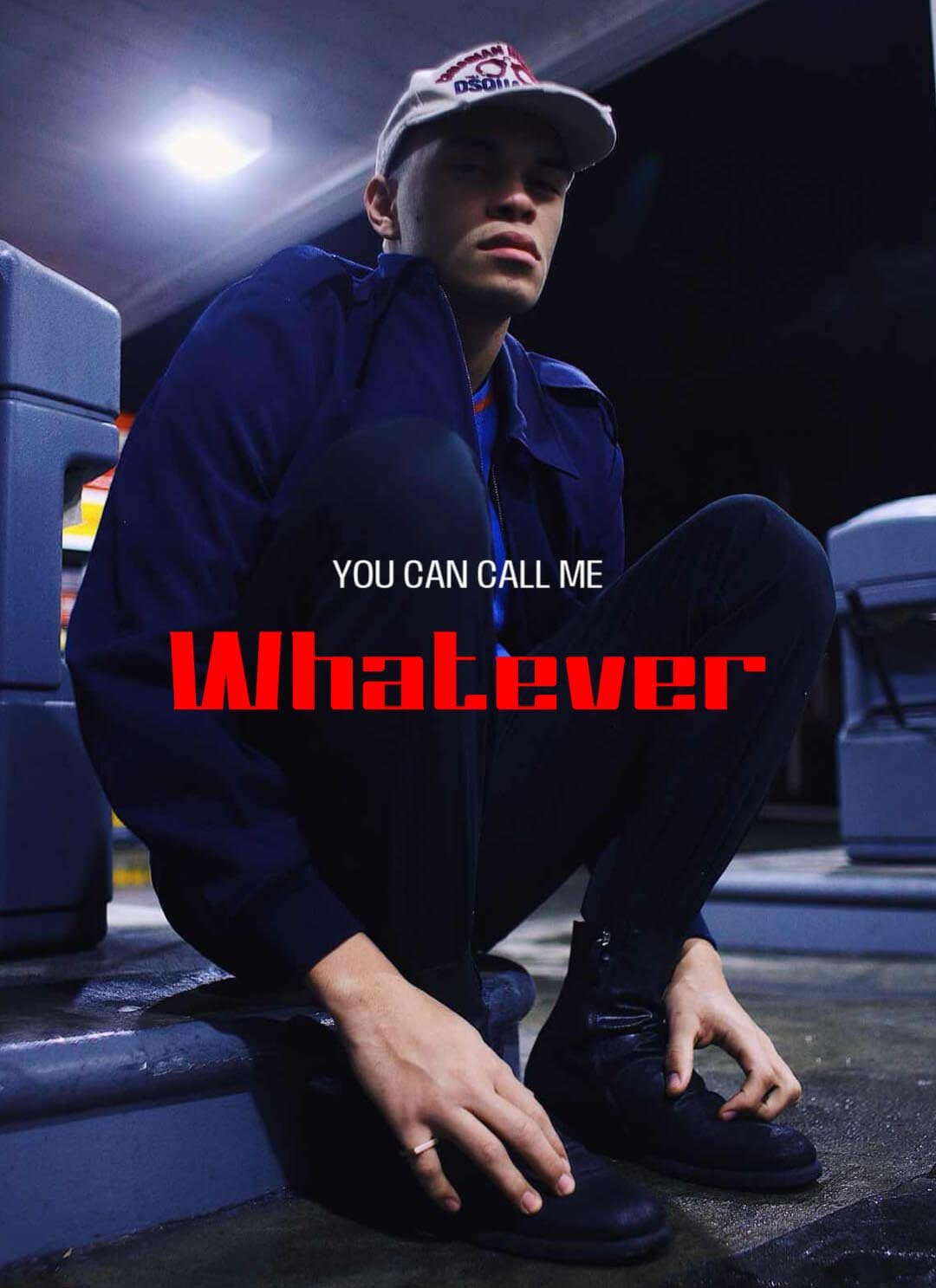
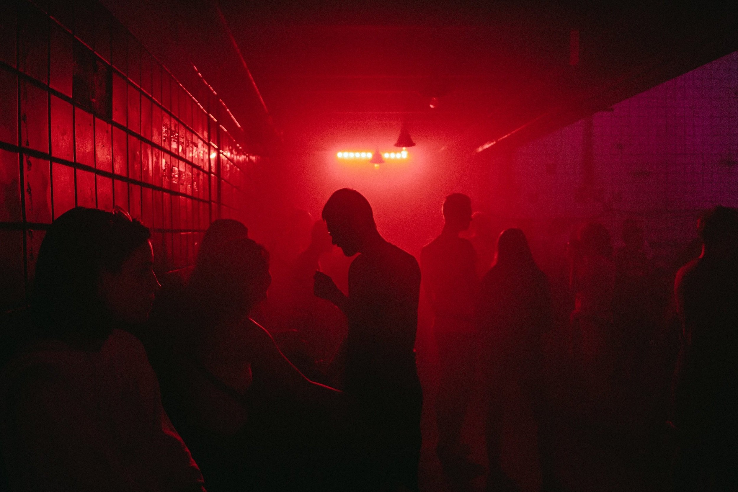
So the brand's strategy, personality, and visual identity just had to be edgy, brave, and nouveau.
Creative process
Naming
I had a desire for words’ visual representation. Somehow went on a French path after iterating on inventive names. Afterward, everything fell into place since I was looking for something entirely new and distinctive. Visoir just clicked.
Visual direction
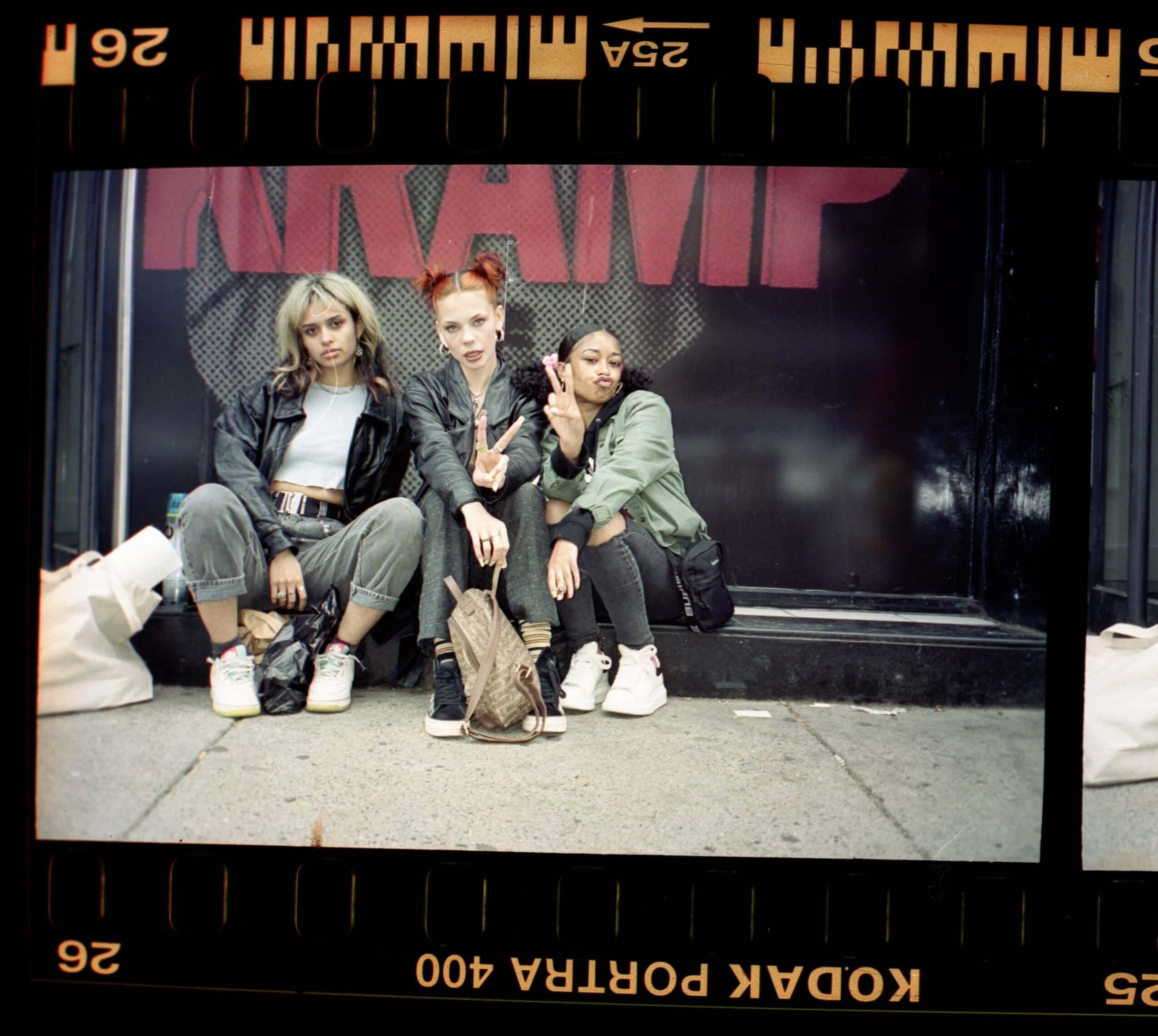
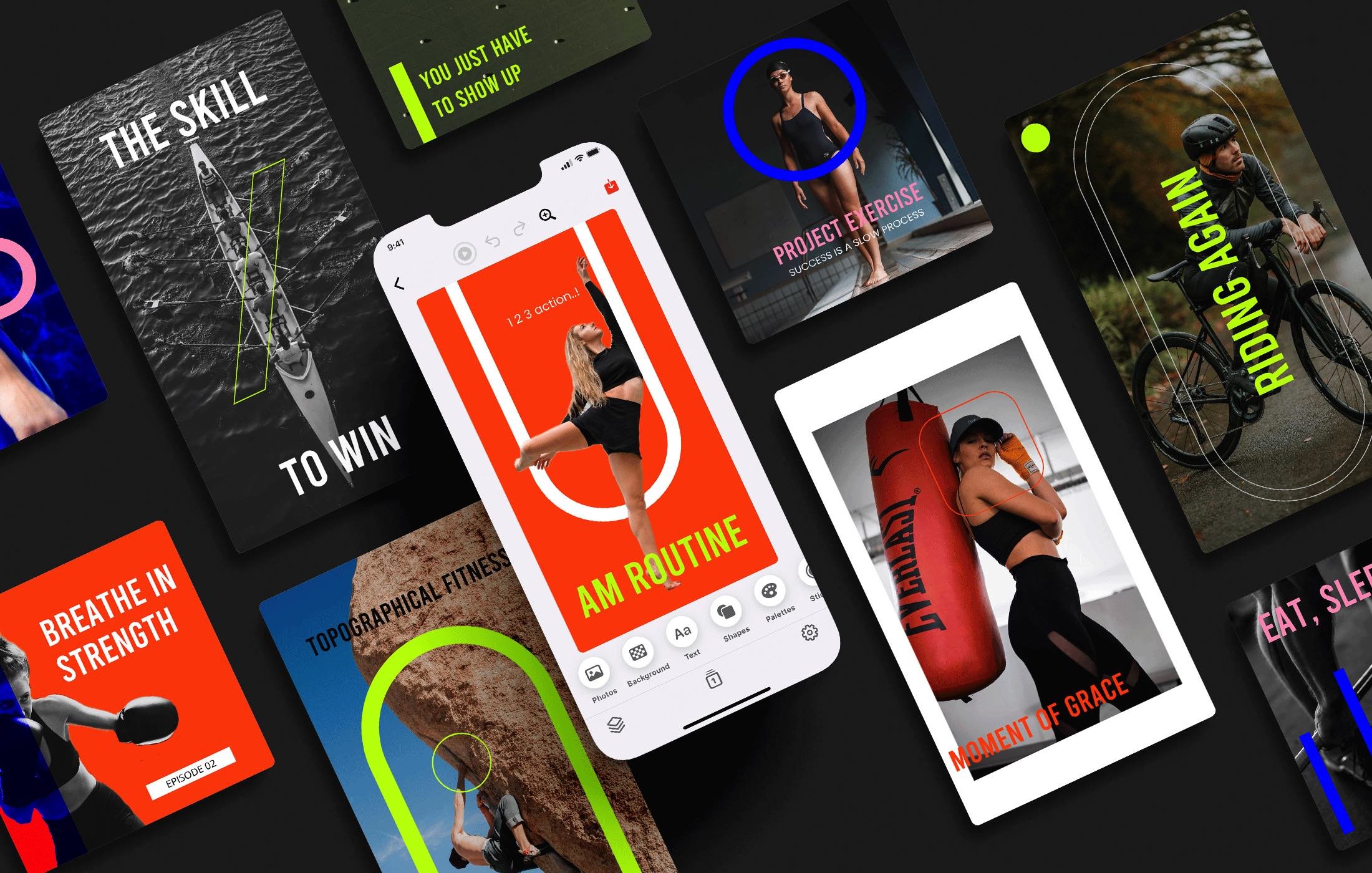
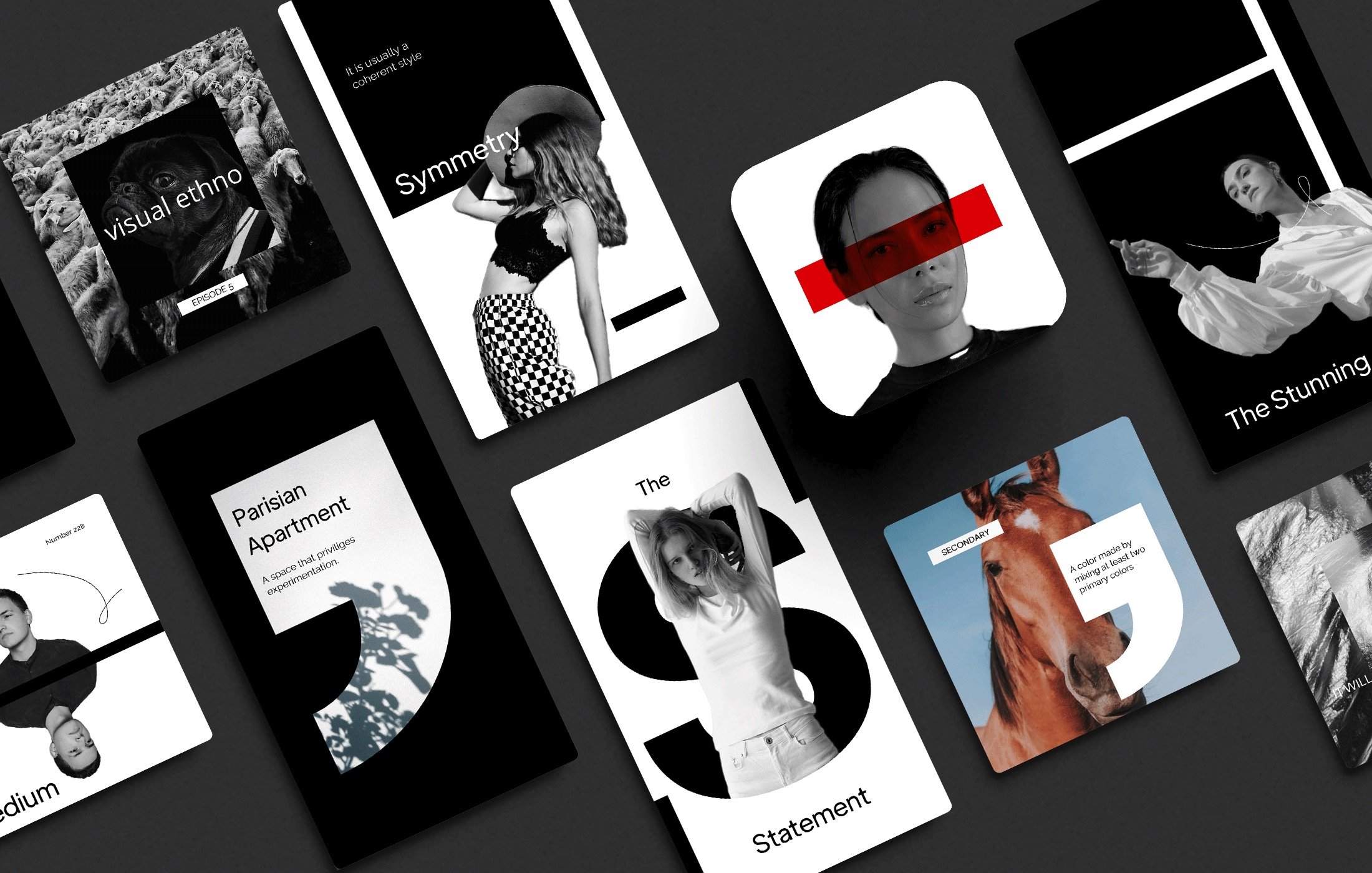
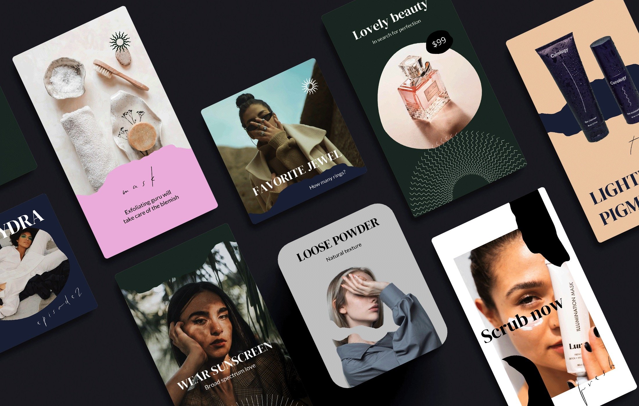
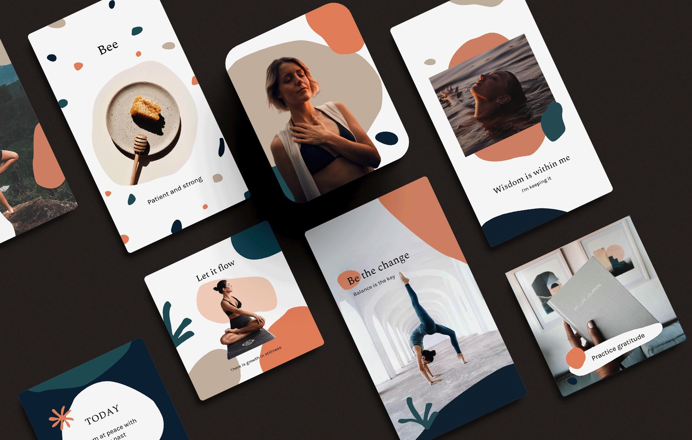
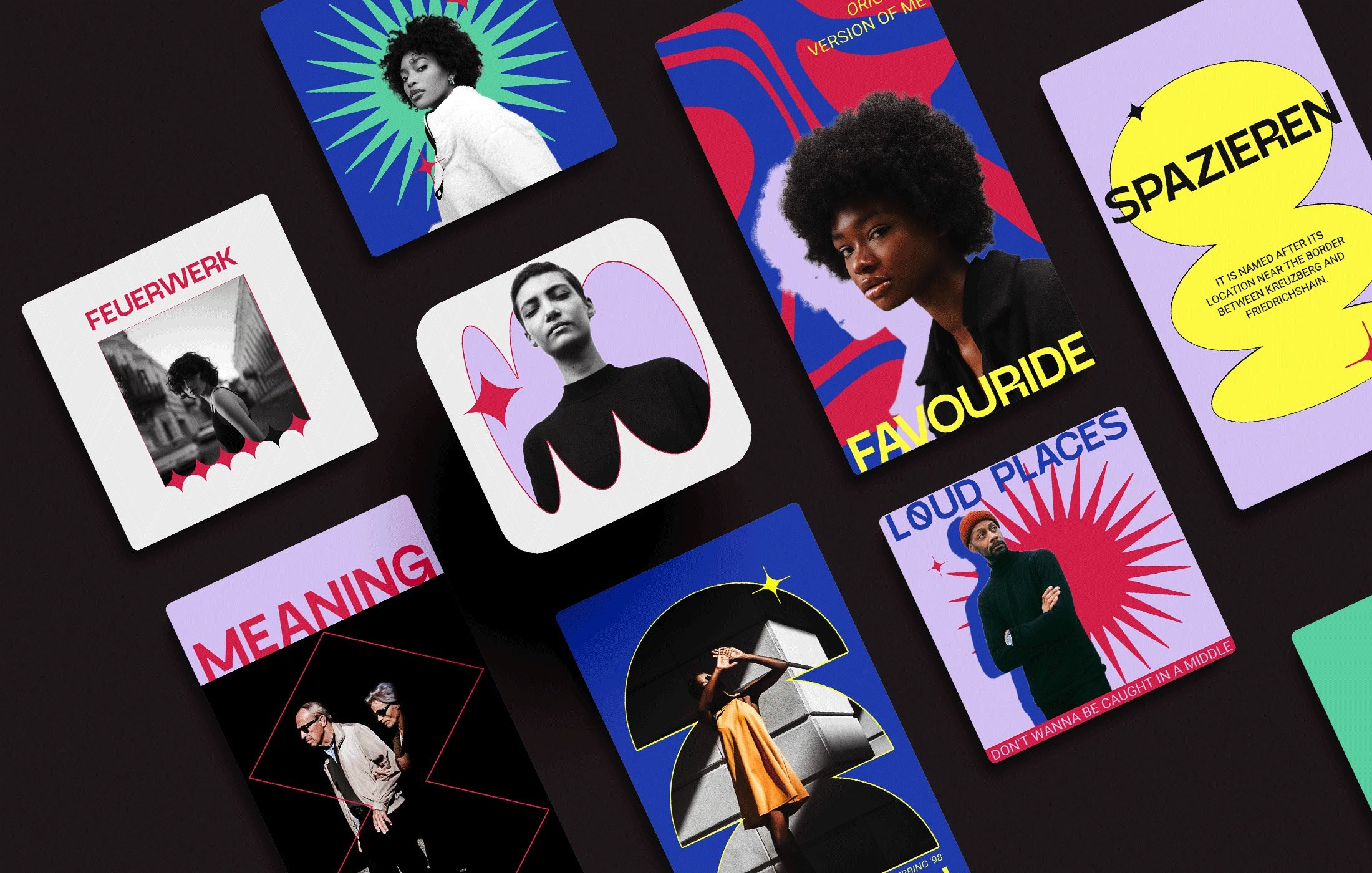
Worked with UX/UI designer and developer to create a seamless integration of templates with the app UI. After broad creator research across multiple platforms, I have mindfully curated styles for the branding sets. Then, a graphic designer put it all together.
Content curation
All the extra graphics and content inside the app were carefully chosen to fit with Visoir’s brand image and ideals. The app’s content had to be all about being bold and cohesive. Photo presets, stickers, or shapes—everything matters.
Brand values & audience
We committed from the start that we would never cut on quality, so all of the designs and graphics in the app are original and were made by me and fellow designers. And those who we wanted to reach—young, aspiring creators who craft trendy content—noticed.


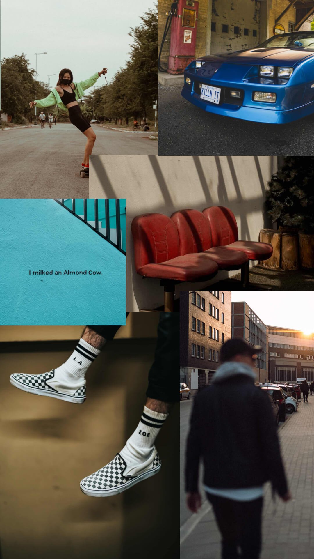
Every brand deserves consistency. I personally planned, reviewed, and edited template collections to ensure they fit together perfectly—we stressed that consistency was crucial to the creator's brand recognition. Since promoting visual coherence was the core of Visoir’s strategy, the brand needed to be as cohesive as possible. And always addressed to our picky target audience—we are not just another photo editor.
Brand identity
Had a clear vision from the start. Saw Visoir as energetic, brave, unique, niche, European, creative, and distinctive. Directed the entire visual identity; got the desired aesthetic by working closely with external designers and doing my own graphic design work (since I am, indeed, a designer). The logo had to be simple to identify but visually striking to set our app apart from competitors. App Store presence reflected the target audience—Gen Z’ers and authentic digital creators. Experimented a lot with the overall appearance. The tone of voice was defined by witty French twists.


